Wednesday 21 October 2009

Photoshop workshop 2

This lesson we were shown how to darken and highlight areas of an image. This is my starting image it is again shot at day so is too bright and not scary.
Instructions:
*click Layer and then new Layer
*change mode to Overlay
*tick box to fill with overlay-neutral colour 950% grey)
* pick paintbrush tool (hardness 0%) (opacity to 10%) depending on how dark or light you want it
*change colour to white to highlight of black to darken. different colours intensify and have different effects.
*Working on an overlay doesn't effect the image.
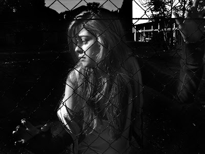
I darkened the background 60% however i wanted her to stand out against the background so lightened her 10%

The sky was still to light so i went to: *Adjustments
*shadows and highlights
This just adds to the shadows and adds contracts to the highlights.
*image adjustments
*hue/saturation
*adjust the Saturation this will bring it down to lessen the intense colour and make it less intense.
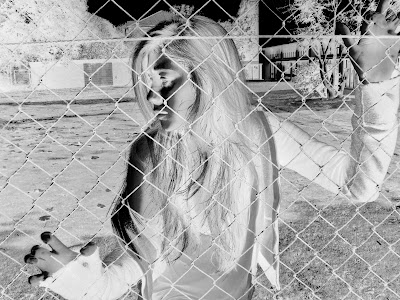
I was inspired by one of the posters i looked at for the Blair Witch Project. The image was inverted which created a very dramatic night image. to create an inverted image i had to use my original image and go to:
*adjustments
*image invert
I had to use my original image as the one i had edited to be darker when i inverted it the dark background would become light and i want the background to be darker.
However if i want to invert my final image, i will have to plan carefully what areas i want to be dark and which areas i want to be lighter.

Teaser Trailer Sequencing

*Institution: production and distribution company
*Text
*Possibly critic comments
*Establishing characters
*Cuts of narrative
*Climax }Tense music
*Cliff hanger or suspense ending

Monday 19 October 2009

HORROR GENRE

Horror And Theory


This is a presentation i found while researching the horror genre, it talks about different horror theories as well as some conventions of horror. i found it quite useful and it gave me another prospective to think about concerning the horror genre

Wednesday 14 October 2009

Photoshop workshop

BEFORE:
- It is in colour
-Taken at mid-day when it was really sunny
-Very bright
-It is not frightening or conveying any of the horror conventions for a poster.


Today we had our second Photoshop lesson, this was to help us get use to some of the features of Photoshop. We used photos we took yesterday to practice on. The photo i used reflects the extreme close-up i wish to produce for my poster.

AFTER:
-I added a Black to transparent circular gradient to make around the face black. This blocked out the hair and focused the eye on to the face.
-Then i change the colour image to a black and white one
-I played around with the light balance to create the inverted night time effect
-Then i added a Conte Crayon filter to create a grainy effect.
Overall this image conveys a sense of horror now compared to how it looked before!

Close-up Posters


Treatment

20 years ago five teenagers were found brutally murdered at the local secondary school, Burntwood. No one knows who did it it and no one knows why.

In 2009 A group of friends decide to go back to school after hours, to invested claims that the five teenagers killed never really left the building. In the darkness of the empty corridors and deserted classrooms what started of as a group of students recording there media project turned into a frenzy of killings. Throughout the night one by one the students begin to disappear as the others try to stay together and find their missing friends. The night of terror ends when day breaks and the daily routine of the school returns to normality.

Thursday 8 October 2009

Final Brief

Product: FILM PROMOTION- teaser trailer, a film magazine front cover and poster for film

Genre: Horror, teen-slasher, suspense

Target audience: 15-24 (with a 15 rating) disposable income, young male and female. Also an audience looking for a different style of horror.

Similar media products: Friday the 13, Blair Witch Project, Cloverfield and Quarantine

Justification of choice of brief: Horror films are extremely popular, with the advantages in technology the horror genre has become more realistic, with sleek graphics and special effects. I want to return to the basic conventions, terrifying killer, screaming teenagers and heart racing suspense.

Representation Issues: Using real teenagers to convey a sense of realism for the audience as well as providing a effective and frighting killer.

Narrative: From looking at trailers for films portraying the narrative in a documentary style, such as the Blair Witch Project and Quarantine. My production will use the same technique.I will use a non-linear narrative as this is a typical convention of a teaser trailer, i will use segments and cuts of my narrative to appeal to the audiences curiosity. I have decided to adhere to the convention of a non-linear narrative as it is an effective aspect of a teaser trailer so there is no need to change this method as it captures the audience attention well.

Creativity: My research has mainly revolved around looking at films that use a hand-held camera to present there narrative, I want to portray my narrative in a similar way. These type of films rely on the sense of truth, and has a detailed advertising campaign to further enhance the idea that the film is reality. I want to link my poster, magazine cover and teaser trailer to convey a sense of realism to the audience as if the event really occurred.

Challenges anticipated: Filming - Capturing a realist style of filming, and making the narrative clear. Actors - Good at improvising the event to make it seem mote real. Editing - using a mix of quick cuts and short cuts, portraying the sense of danger and fear using transitions and making it look like a hand-held film.

Digital technology: I will use the Internet for my promotional campaign, placing my teaser trailer on networking websites and having its own promotional website. The Internet is an effective way of reaching your target audiences as well as a wide audiences, especially if the production is more independent and has less funds, it can reach the audience it needs.

Sunday 4 October 2009

Empire: Film Cover Analysis

  • Dominate image of the the main character. It is a head ands shoulder shot and he is gripping his hands together. This is to show the contrast between his normal human hand and wot appears to be an over sized, stone robotic hand.
  • The purpose of having the main character or actor on the front cover is to promote the film. Hellboy 2 is a sequel and the comic genre. Usually with the comic genre the character is shown on the front cover rather than the actors as the character may be in costume and the film might be better known for the characters rather than the actors.
  • the cover is not presenting a horror film however it coveys some horror conventions. The use of the edited flames on the title suggest death and hell which are commonly connected with the idea of horror.
  • The black and red theme is sinister and dark which connotes evil and hell
  • It is ironic as he has pray beads around his wrist as he is meant to be like a devil.
  • There are teasers and plugs down the left hand side of the cover and the title of the the film is at the bottom of the page the same colour.
  • Empire is a mainstream and well known film magazine, it would be an effective way to promote my production along side my teaser trailer and poster. Film magazines are targeted at people who are demographically interested in films, so is a good marketing method as it creates awareness to an interested audience.
  • Also magazines such as Empire are distributed across the UK and are even produced globally meaning a production can react a wide audience
  • The Dark Knight issue for Empire is very successful. I came across these two cover while trying to research film magazines with a horror genre. This two covers might not be for the horror genre but the promotional strategy is very fascinating.

There is two different main images for the same issue of the magazine. They have the same identical tags, teasers and information just the character is different. One is Batman and the other is the Joker. The Batman cover is blue and black to represent the night, as bats only come out at night.

The theme for the Joker's cover is green and black his appearance is more sinister. He is meant to symbolise and evil clown. The two covers are to promote the battle against good and evil. This is demonstrated by using the two main characters the villein and the hero. when i produce my film magazine front cover i could use two images one of the victim and the other of the villein.

Blair Witch Project Posters